

UX/UI 2021
EASE-E
OVERVIEW
The scope of this project encompassed the development of a responsive website dedicated to a particular aspect of health, accessible across multiple devices including desktop and mobile. Choosing to concentrate on mental health, with a specific focus on depression and anxiety, was a deliberate decision based on the substantial understanding of the topic. Explore Ease-e's desktop website here.
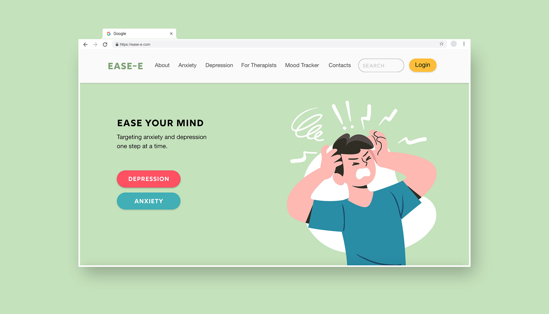
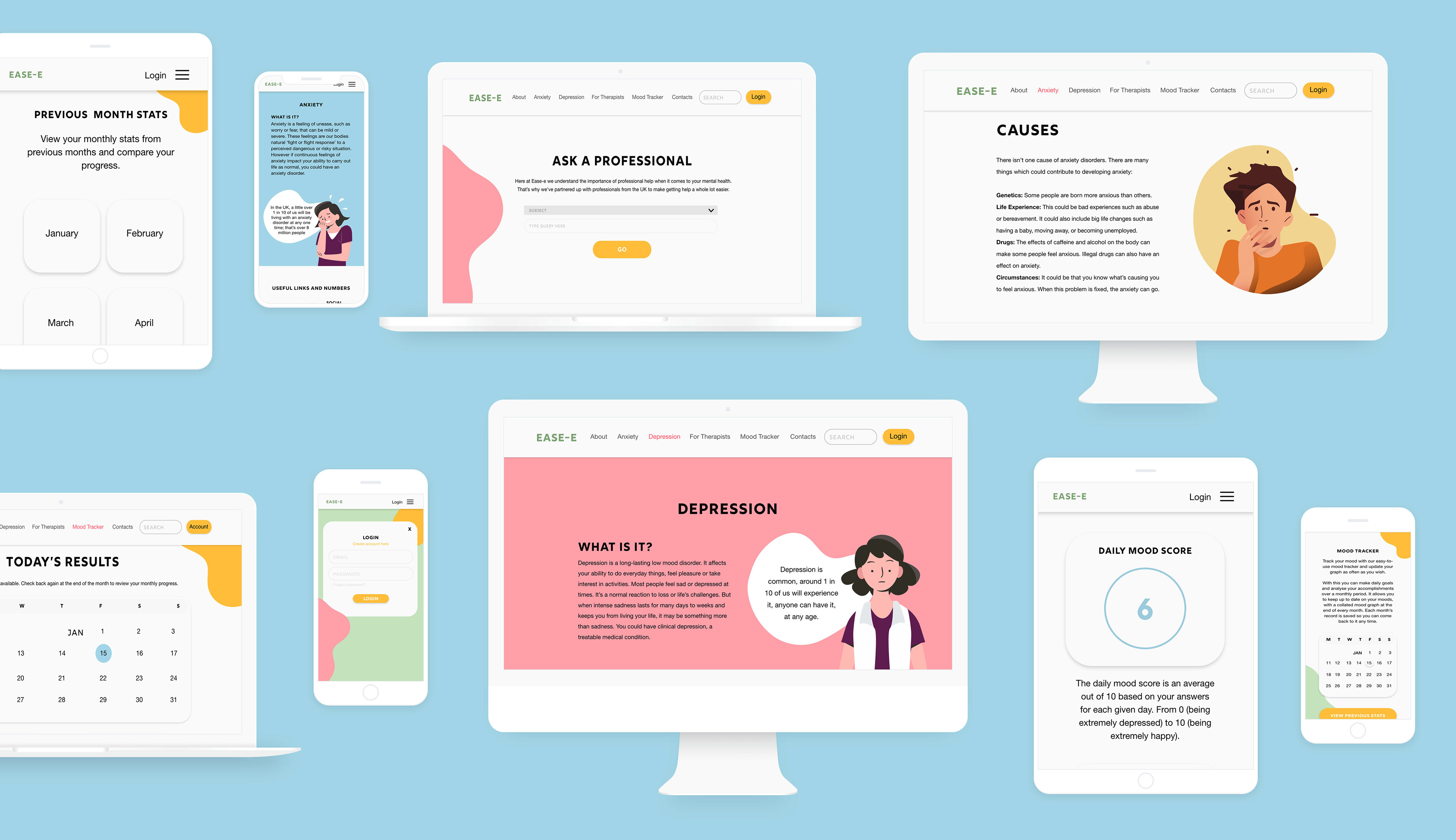
Screen of desktop homepage
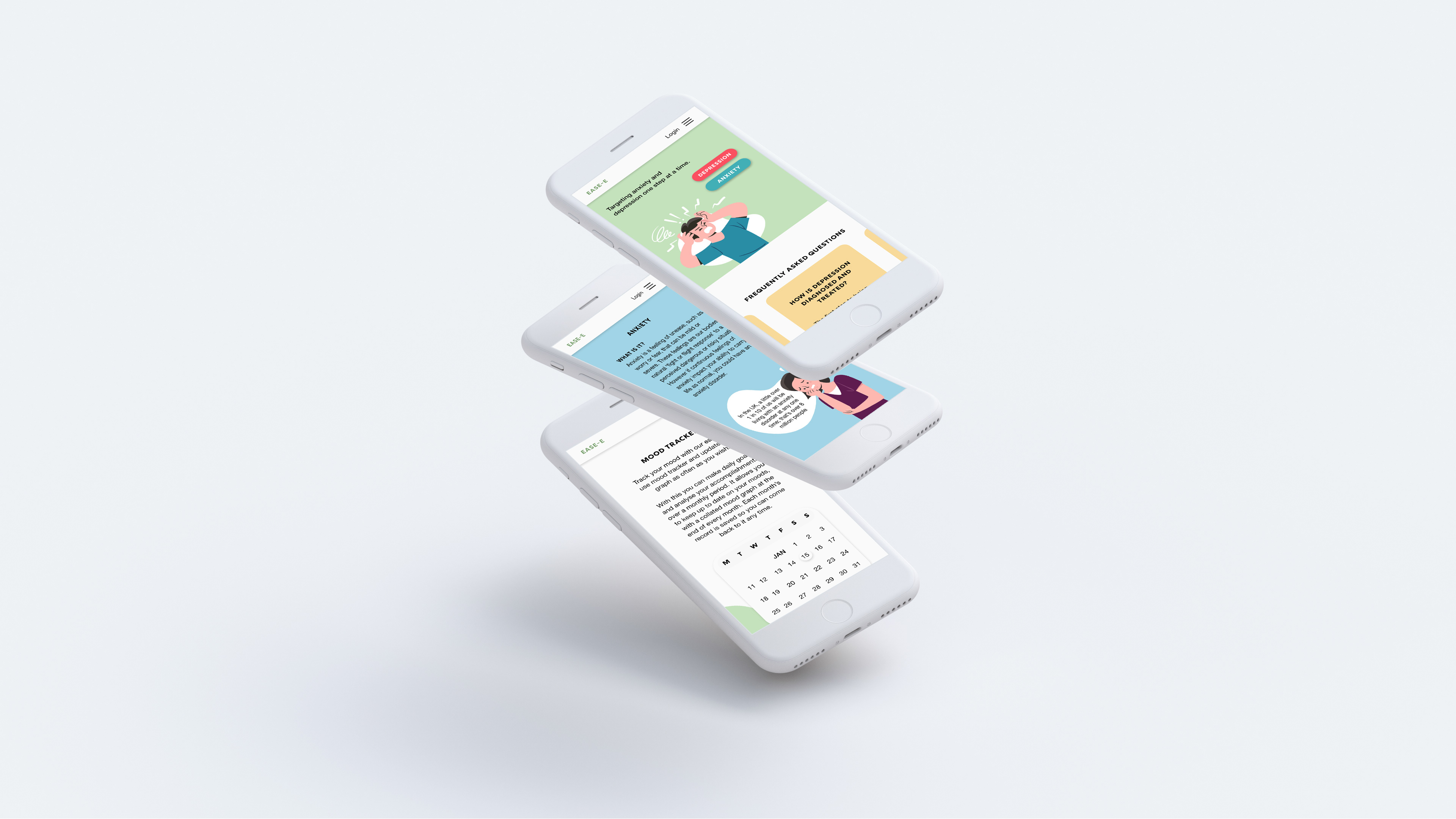
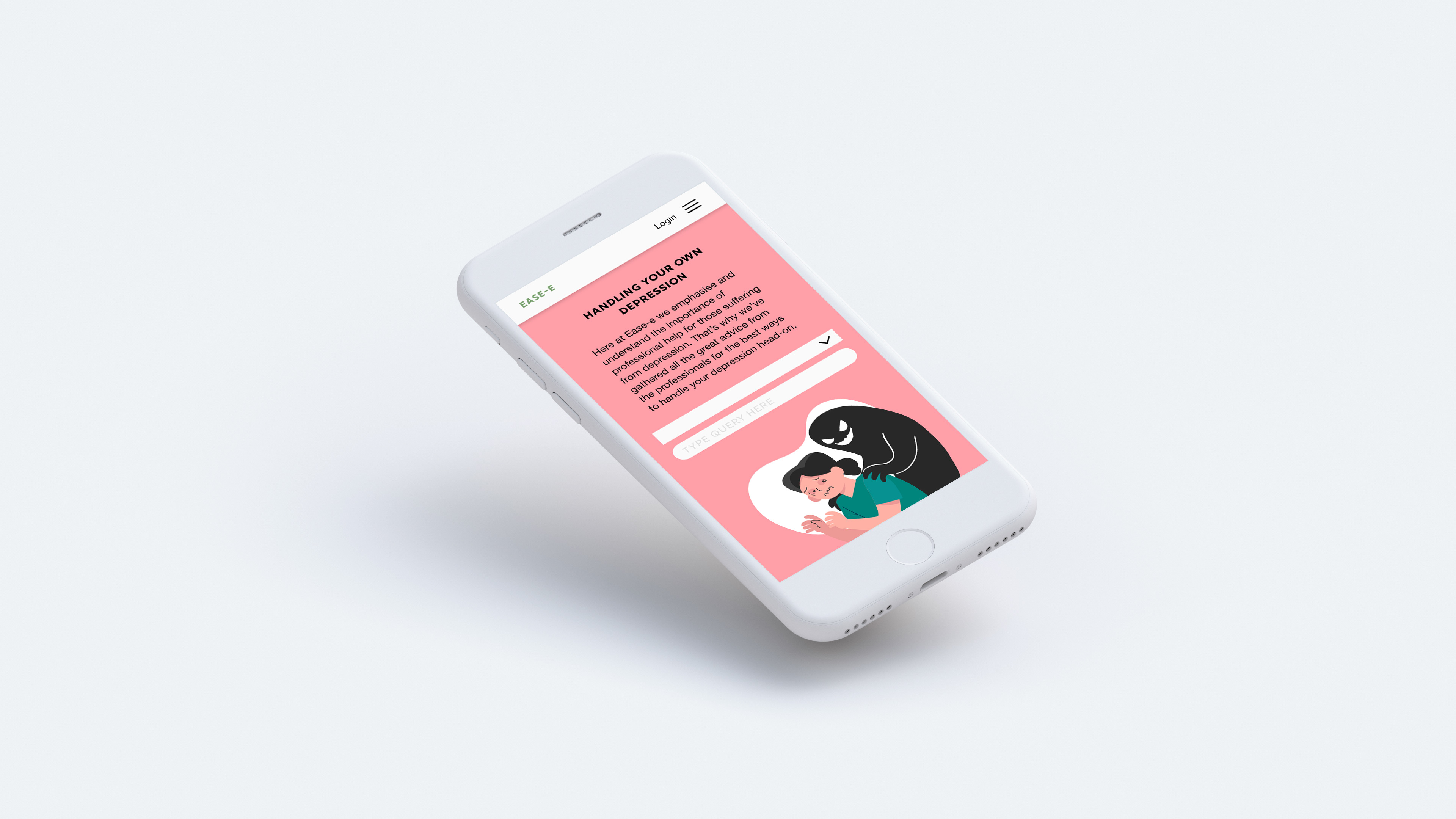
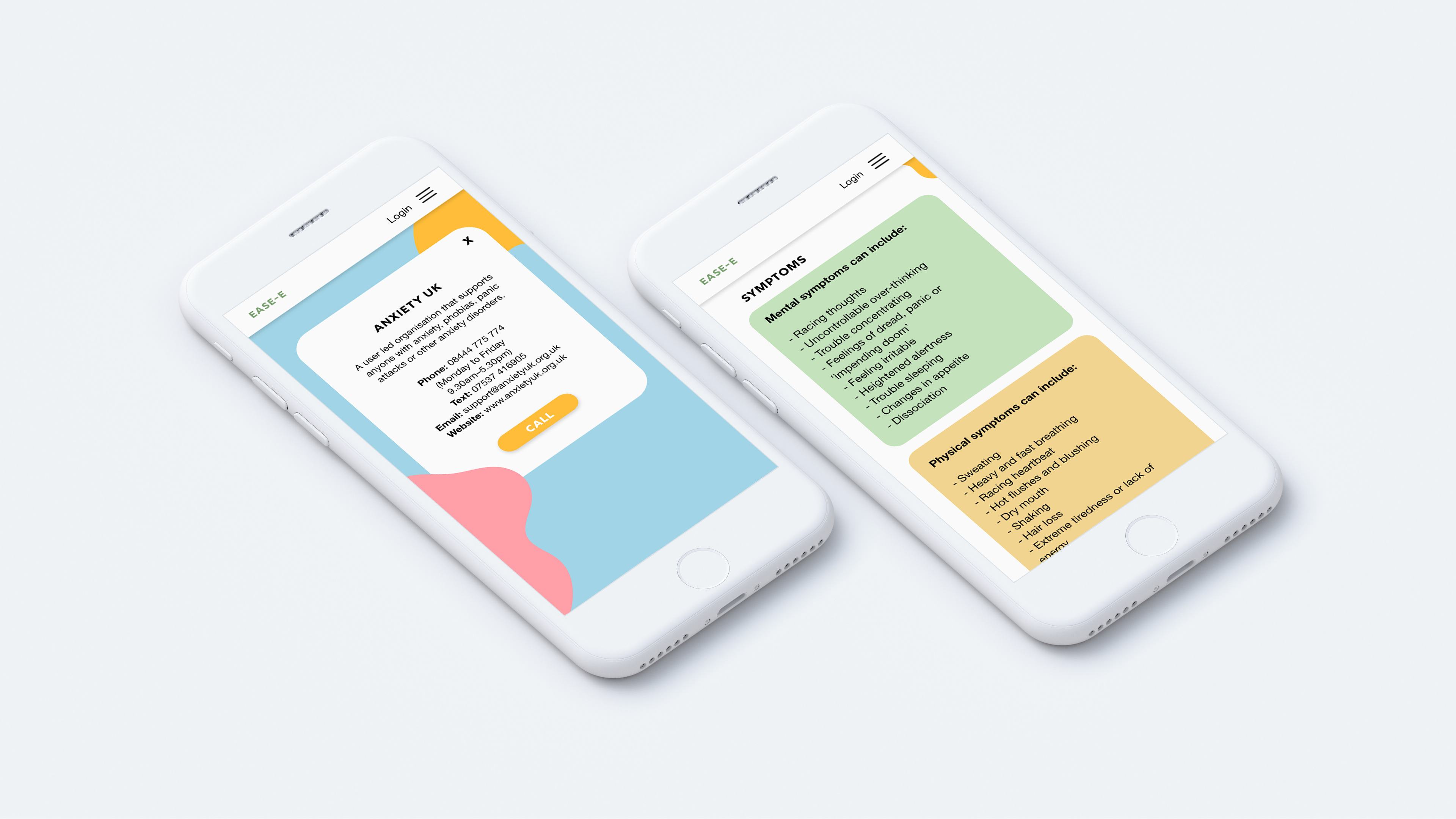
Screens of mobile site
The primary objective of the website was to design and implement a range of features that would cater to the needs of the end users, enabling them to accomplish their desired outcomes effectively. During the design process for each feature, particular attention was given to three key user groups that the website aimed to serve: sufferers, helpers, and therapists. This approach aided in refining and emphasising the specific goals that the website should facilitate for each user group.
WIREFRAMING
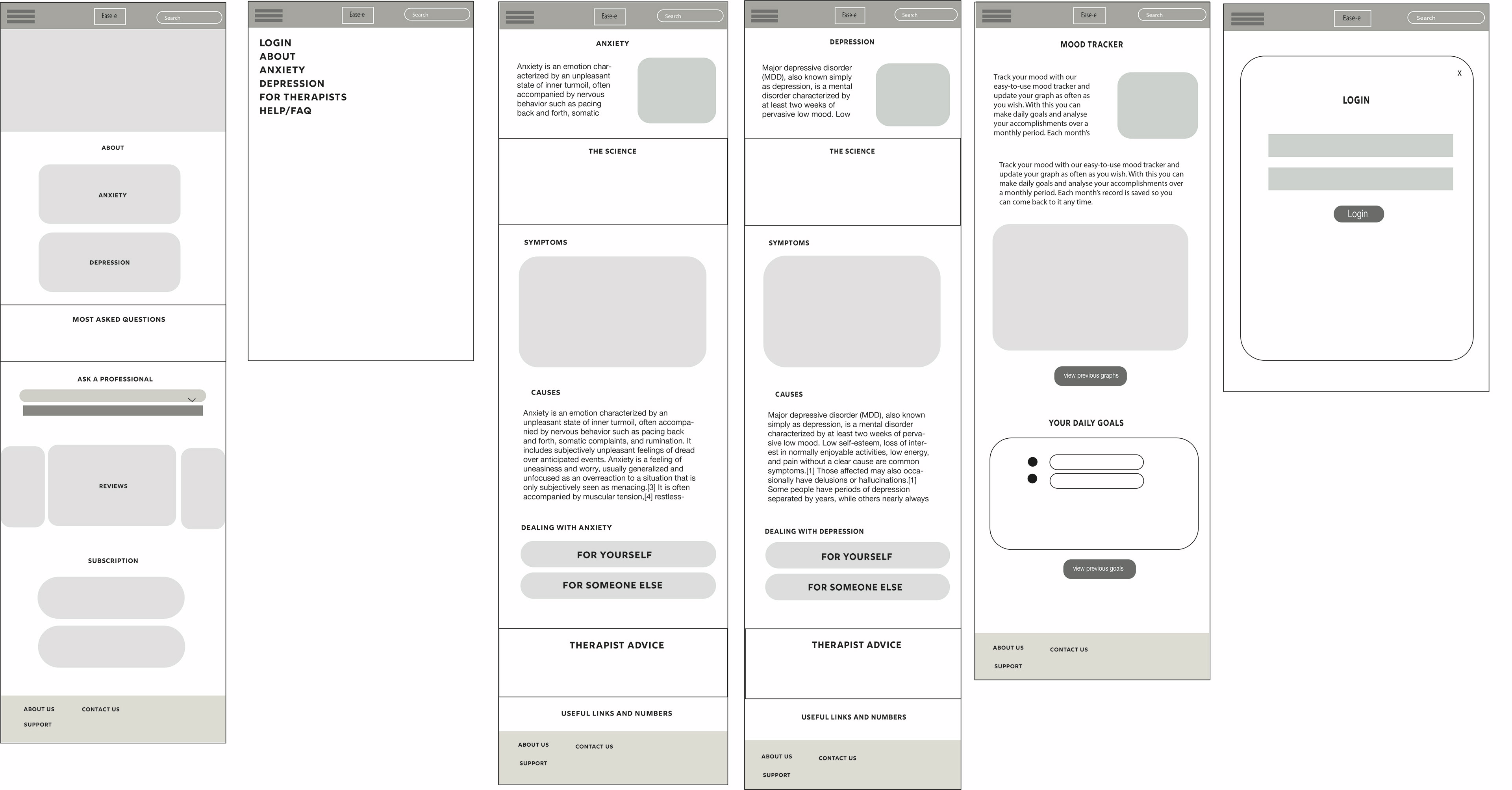
Prior to developing the branding, the initial phase of this project encompassed the creation of wireframes to outline the essential elements to be incorporated into the website. These wireframes were based on user personas and site page flows, outlining the main features intended for implementation. Wireframes serve the purpose of mapping the foundational structure of content placement throughout the site, aiding in the visualisation of the necessary number of pages required for the entire website.
BRANDING
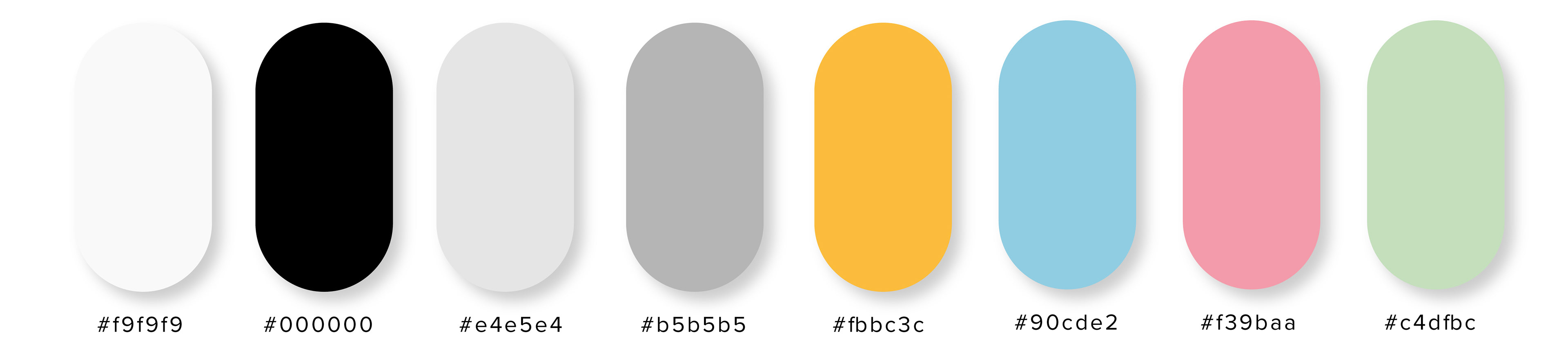

When it came to branding, the primary vision was to establish a clean and polished style for the website, complemented by suitable illustrations and colours. Rig Shaded and Helvetica were selected as the typefaces, as they offer excellent legibility even at small scales, which was crucial for the mobile version of the site. Maximising legibility was a key consideration to ensure inclusivity for users who may have conditions such as dyslexia. In order to make informed and inclusive design decisions, extensive research from articles and journals were undertaken in order to deepen the understanding of screen design. One article that played a significant role in shaping the design choices was "UX Design: How to Make User Interface Readable" by Marina Yalanska, which can be read here.
MOCKUPS
Screen of mobile site
Screens of mobile site


