

PACKAGING 2022
CHASE ATLANTIC
OVERVIEW
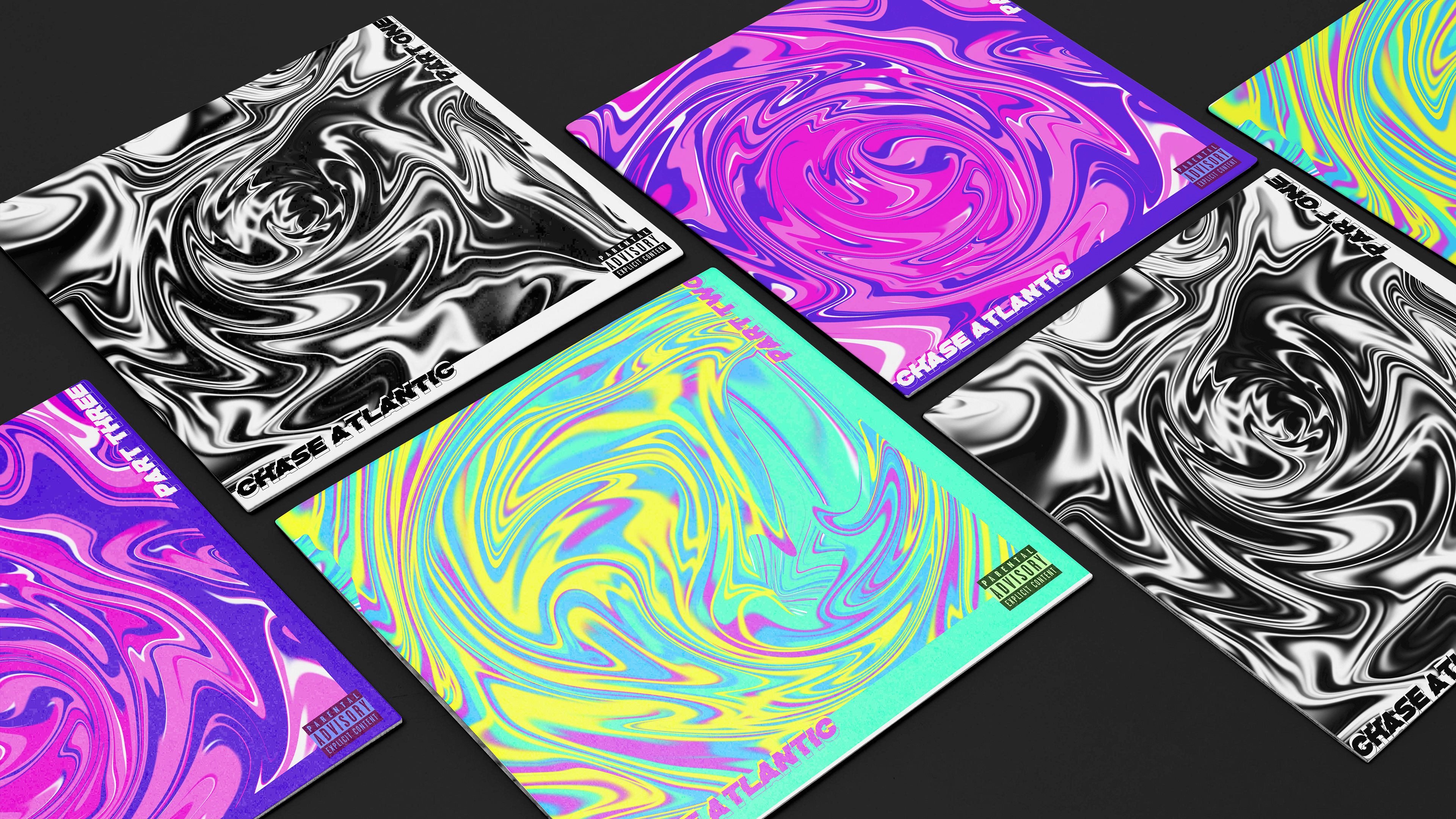
This freelance project involved a re-design of Chase Atlantic's trio of individual EPs, which saw their release in 2017. Chase Atlantic, an eclectic alternative indie/pop band, draws inspiration from a fusion of rock and R&B, a characteristic essence distinctly present within their musical compositions. Each of the three EPs within this collection manifests the band's multifaceted genres and encapsulates the diverse array of topics they explore throughout their discography.
Vinyl covers
The inspiration behind the trio concept emerged from listening to the EPs and full-length albums. Originally released in consecutive months within the same year, the EPs were aptly titled Part One, Part Two, and Part Three. As part of the comprehensive redesign process, a bundle collection, encompassing all three EP albums, was envisioned, which could be acquired as a cohesive package along with accompanying merchandise, creating an enticing offering for fans.
BRANDING

Colour palette

Typeface
When it came to typography, the primary objective was to maintain a minimalist approach, considering that the cover designs were already visually vibrant and captivating. An extensive exploration of various experimental typefaces, comparing each to the band's existing album designs was undertaken. Through this analysis, it became evident that many of the current albums featured bold sans-serif typefaces, often accompanied by colours either within the typeface itself or in the accompanying photographs/illustrations. The final decision was to embrace and continue this stylistic element in my own re-design, as it not only aligned well with the desired artistic direction but also preserved a vital aspect of the band's identity.

Original album artwork

After running through each EP's musical journey, the conscious decision to opt for a more abstract design approach as opposed to the original photographic material found in the artworks was made. The aim was to visually capture the richness and diversity of genres that resonated throughout each track within the reimagined artworks. This creative direction led to various avenues of experimentation, resulting in the design of three distinct abstract art pieces. While sharing a common stylistic thread, these artworks also showcase marked differences, primarily manifested through the use of three contrasting and vivid colour palettes. This artistic choice draws inspiration from the original album covers, where each EP featured the same photograph but differentiated solely by its colour scheme.
MERCHANDISE
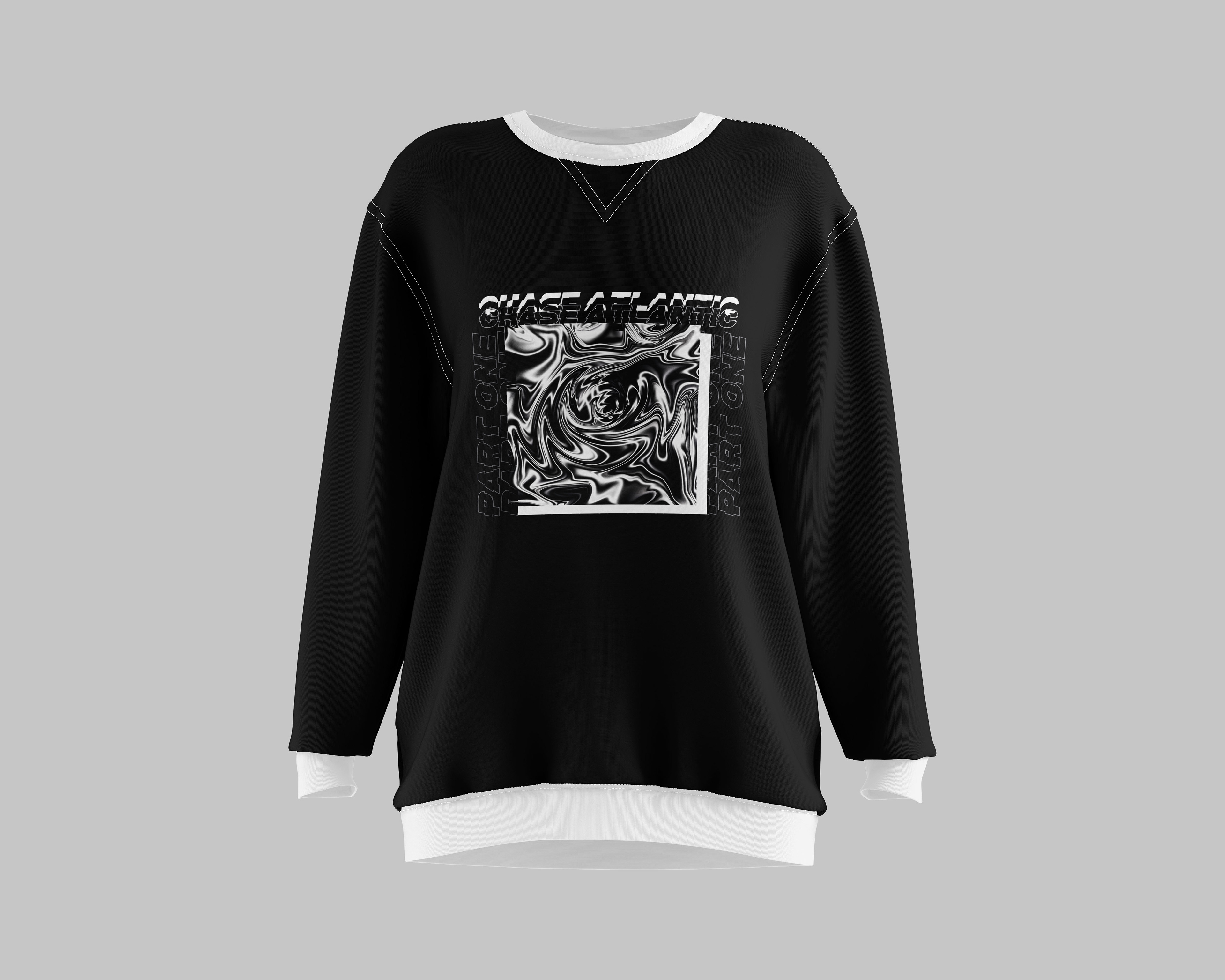
Sweatshirt design
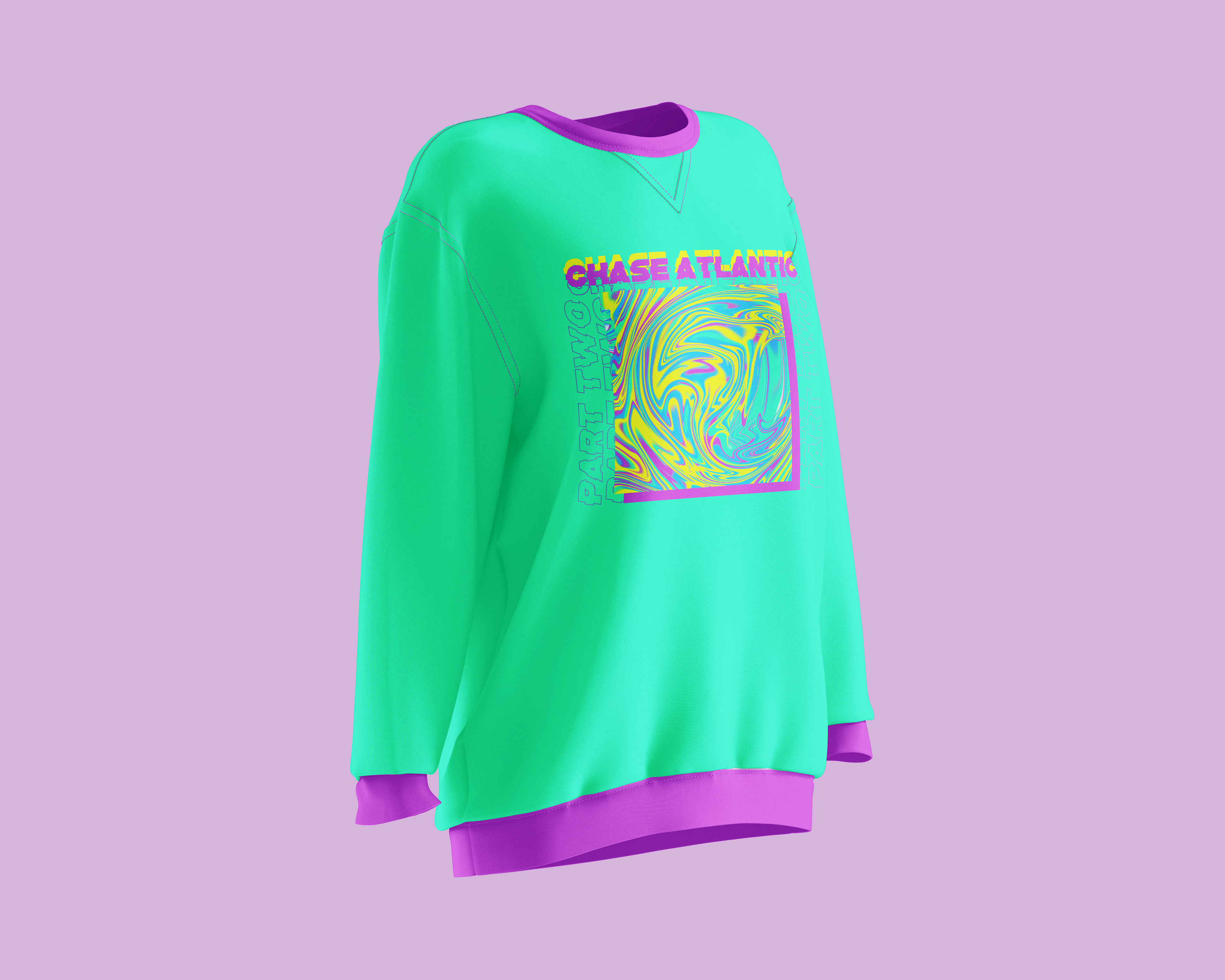
Sweatshirt design
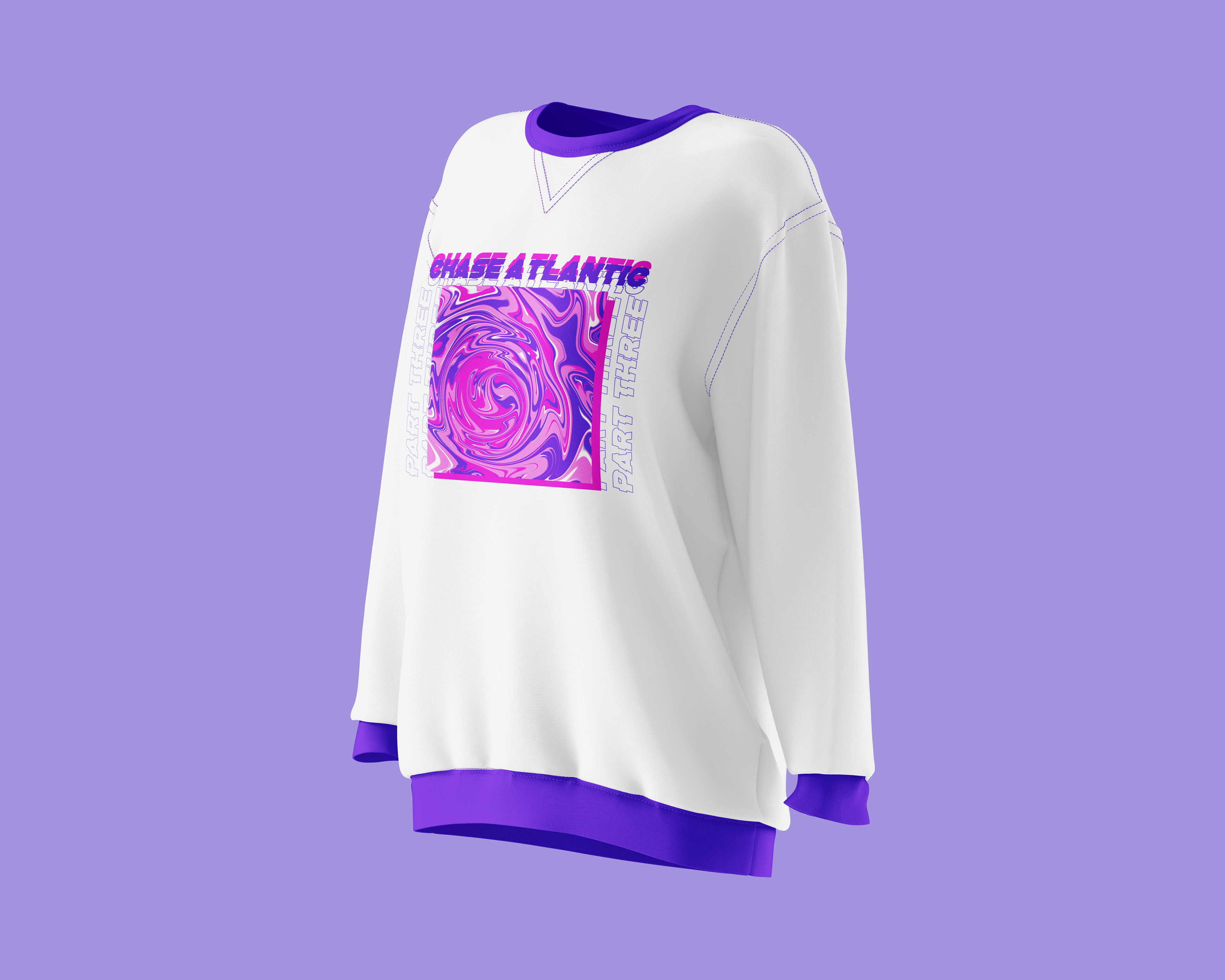
Sweatshirt design
In addition to the vinyls, the creation of sweatshirt designs to complement the merchandise available alongside the albums was done. Each colour palette employed in the sweatshirt designs was derived from the distinct colours featured in the corresponding album artwork, effectively indicating the association with a specific EP. The decision to offer a trio-set of sweatshirts, rather than individual pieces, stemmed from a thorough analysis of various apparel stores that demonstrated notable success in terms of both sales and design aesthetics. The research findings revealed that sets of merchandise often garnered greater appeal, as they evoked a sense of delight and fulfllment in consumers who relished the experience of ‘collecting’ each design or component of the set.
MOCKUPS
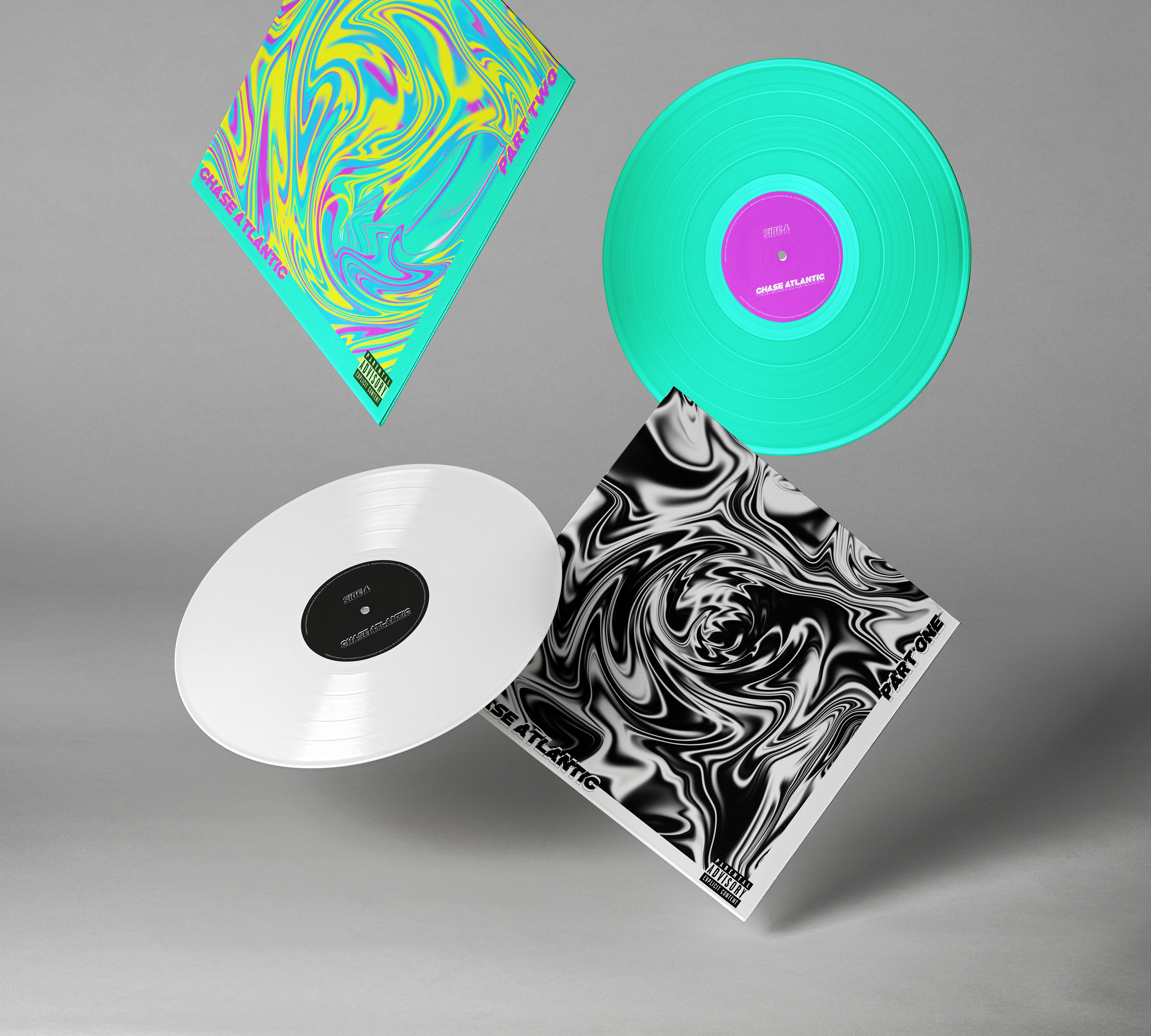
Part two and three vinyl covers and records
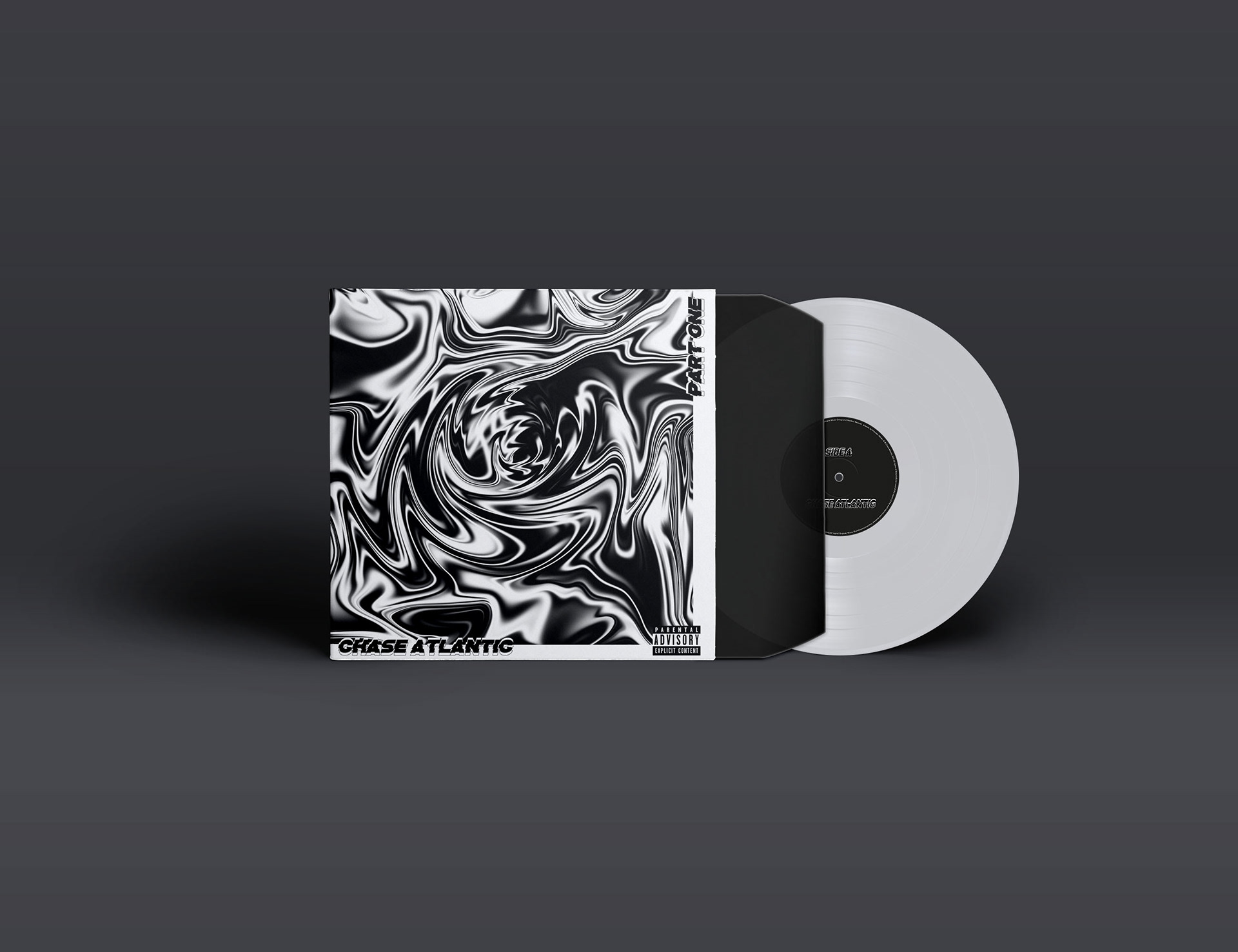
Part One vinyl
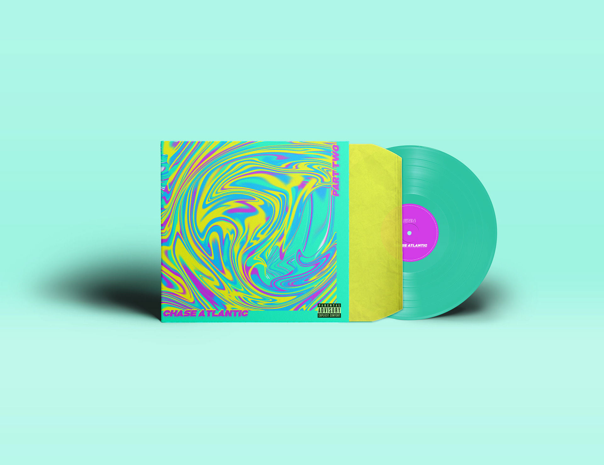
Part Two vinyl
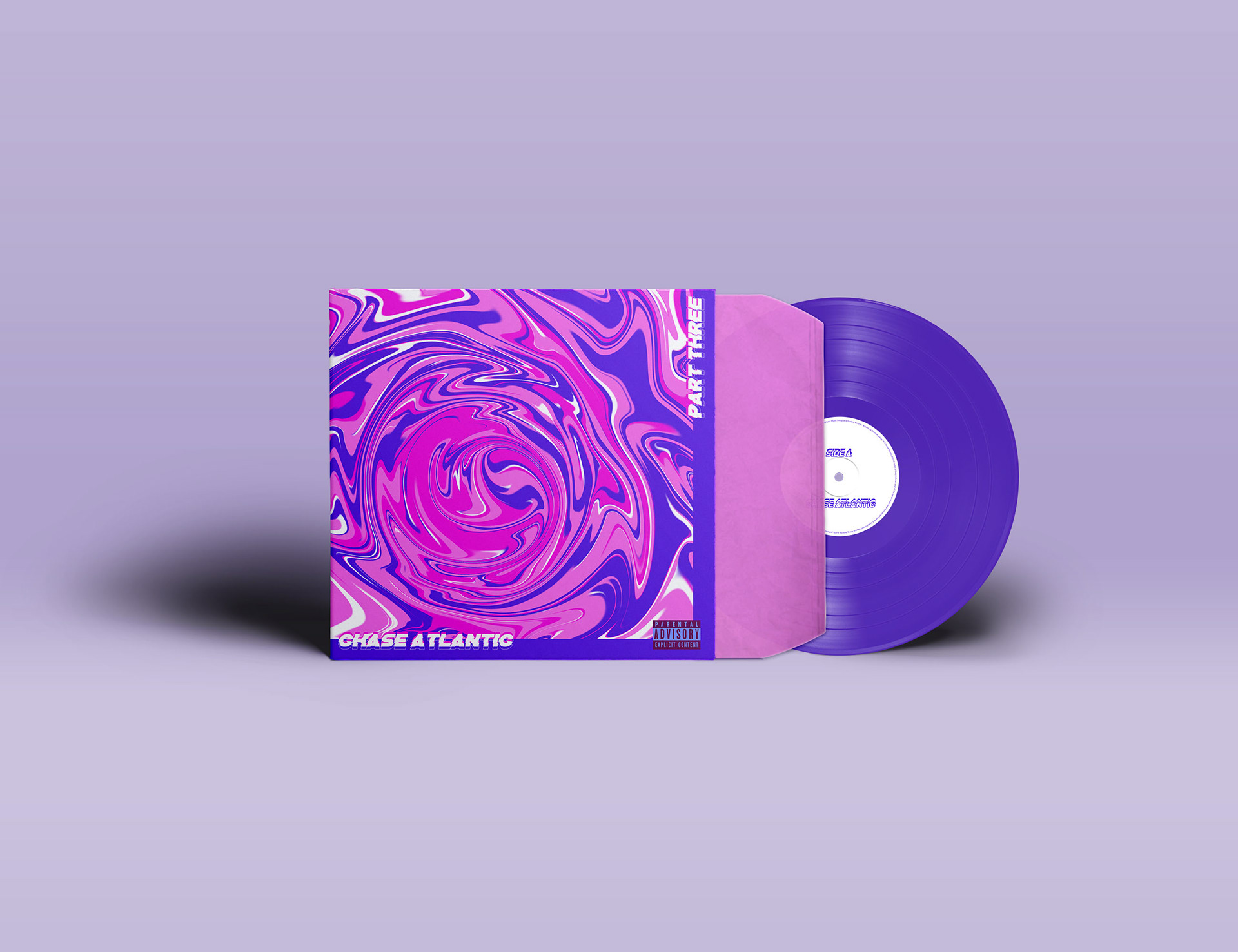
Part Three vinyl
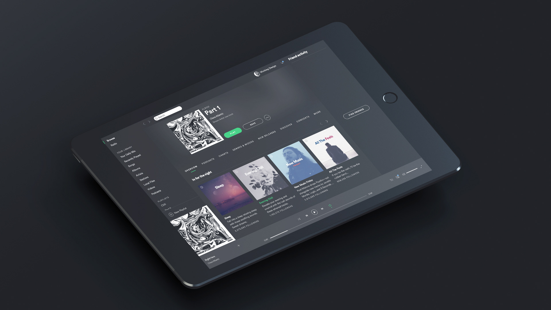
Spotify
Final crafted mockups of the vinyls and album covers, seamlessly integrated into real-life settings. These in-situ presentations serve as a testament to the attention to detail and commitment to delivering a truly immersive experience.


