

EDITORIAL 2020
LARGE TYPE IN PUBLIC SPACES
LARGE TYPE IN PUBLIC SPACES
OVERVIEW
Design for a typographic book titled ‘From the Book to the Streets: Large Type in Public Spaces'. The aim was to design a book cover and page layouts which was purely typographic, reflecting the feel of the inside pages and genre.
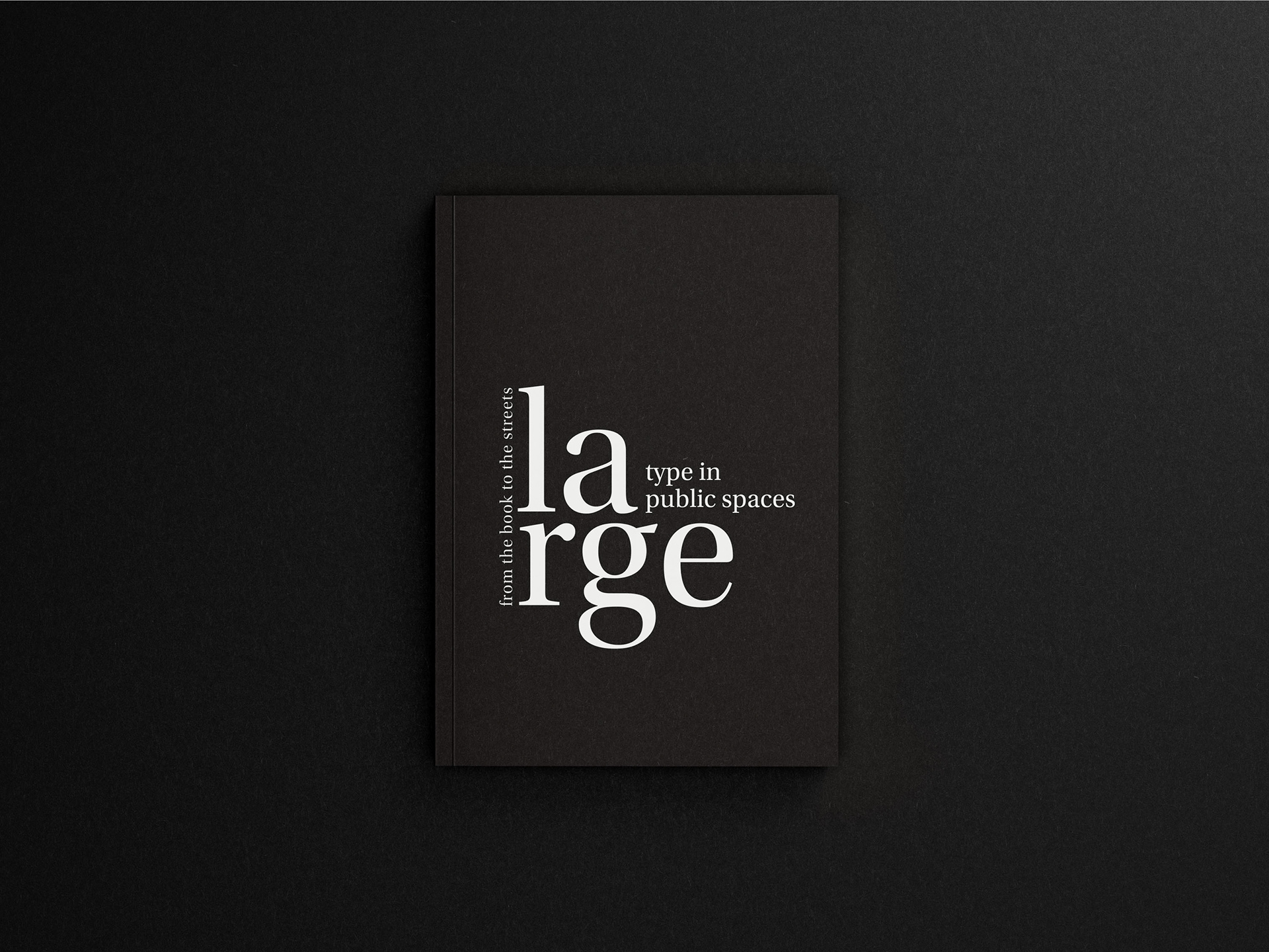
Front cover design
The primary objective in designing this book was to highlight meticulous typographic skills, crafting a visually striking cover that aligns with the genre and captivates the audience. To achieve this, the approach involved maintaining a predominantly minimalistic aesthetic for both the front and back covers. Given the potentially mundane nature of the genre, it was essential to create a design that would resonate with the intended audience and pique their interest.
TYPOGRAPHY

Examples of some of the typographic details within the inside pages
In the process of designing the inside pages of this book, special attention was given to incorporating smaller elements of information, such as footnotes and figure numbering. This necessitated a meticulous focus on typographic details to ensure optimal legibility and clarity of the content on each page. By carefully attending to these finer typographic elements, the goal was to enhance the readability and accessibility of the information presented throughout the book.
MOCKUPS
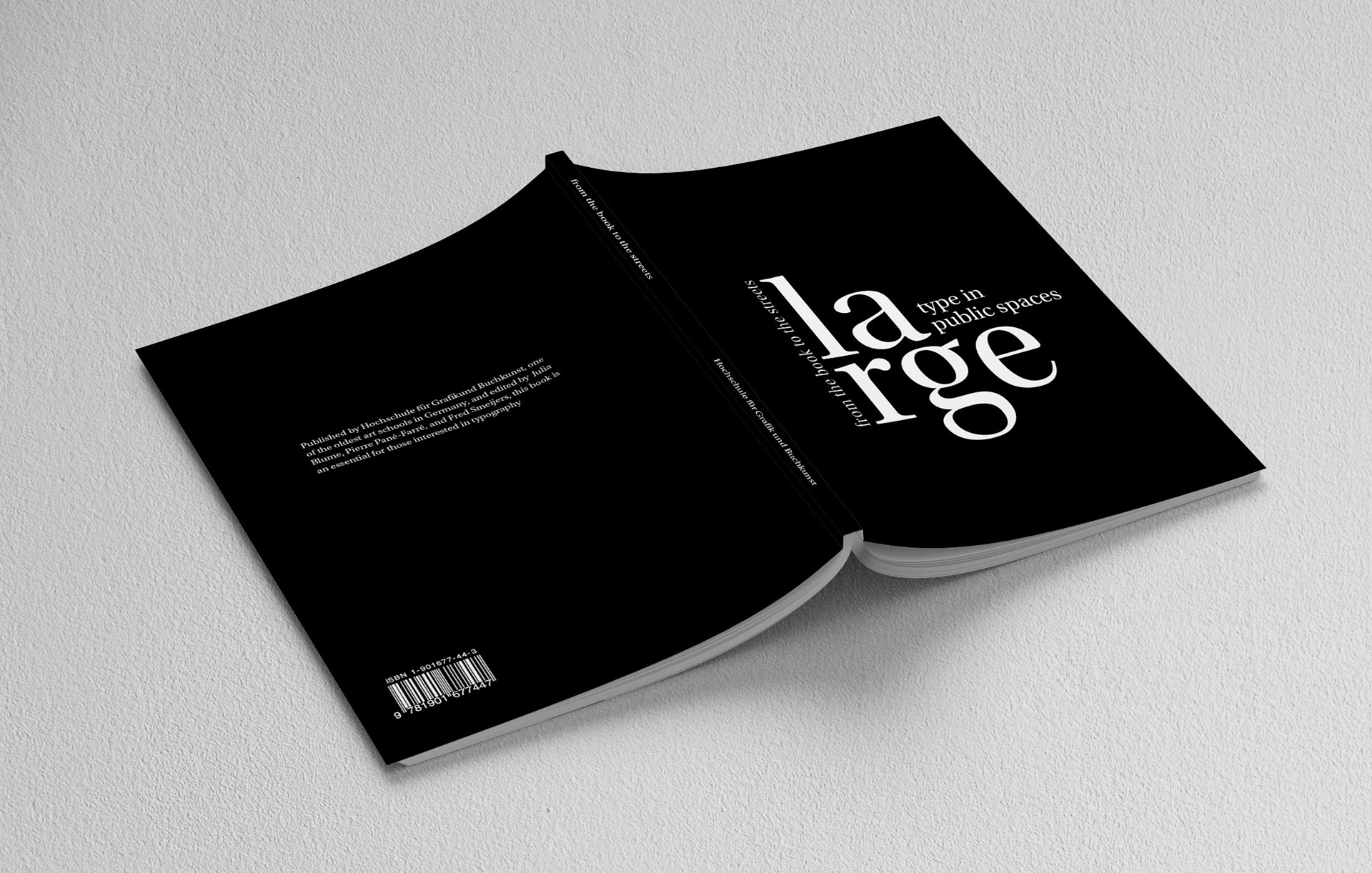
Full cover design

Example of inside pages
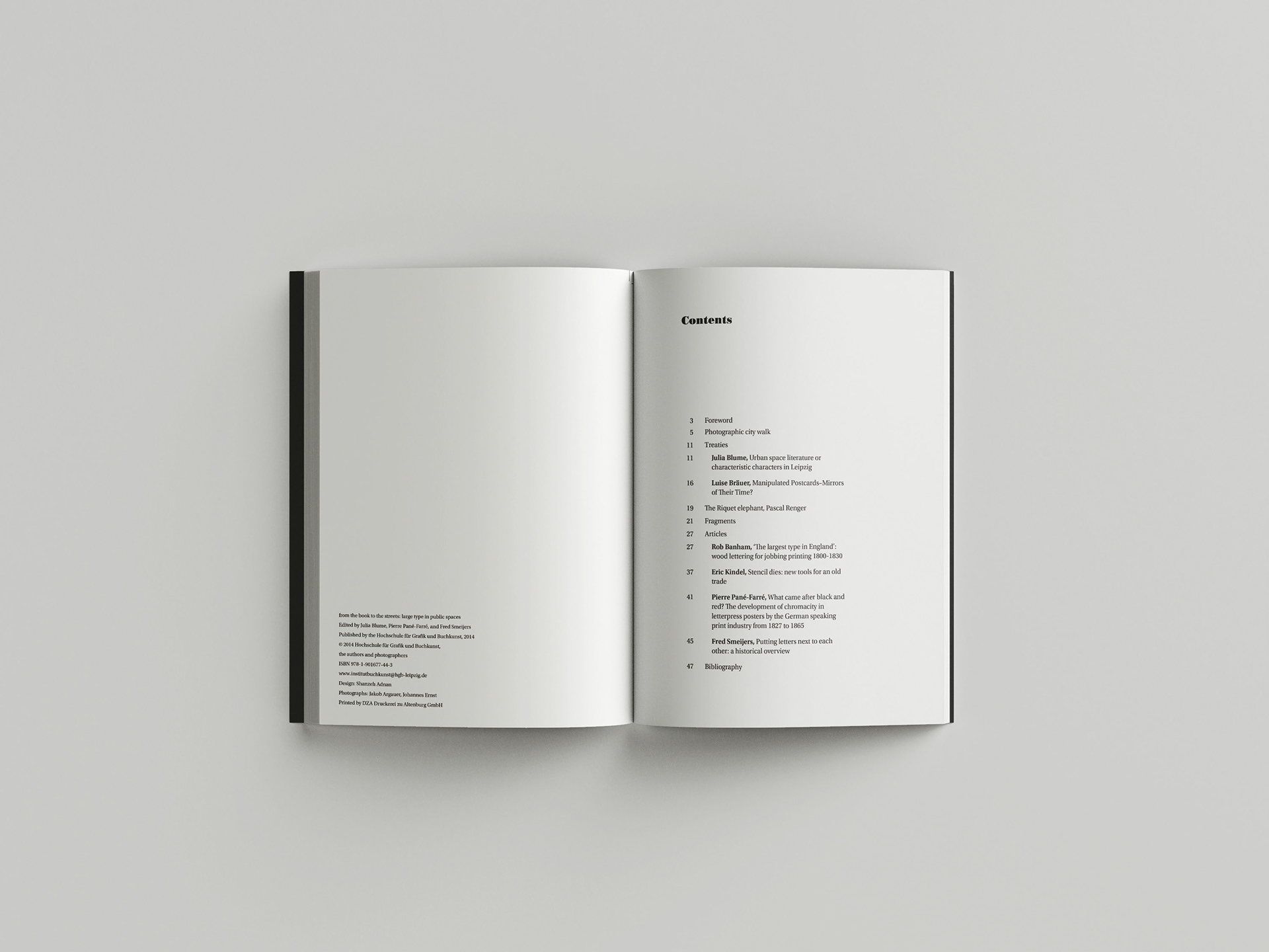
Example of inside pages

Example of inside pages
The decision to use a matte print finish on the whole cover was done to create some textural diversity. These in situ mockups provide a realistic representation of the final product as well as offering a glimpse into the book's potential impact and the immersive experience it can provide to readers.