

UX/UI 2022
DATA VISUALISATION
DATA VISUALISATION
OVERVIEW
This particular data visualisation project encompassed the design of comprehensive visual representations tailored for two distinct audiences: a general and an expert audience. The chosen focal point revolved around the subject of COVID-19 mortality and vaccination rates, an area in which copious amounts of data has been generated, scrutinised, and widely used. View the general audience and experts audience data visualisations.
DATA COLLECTION
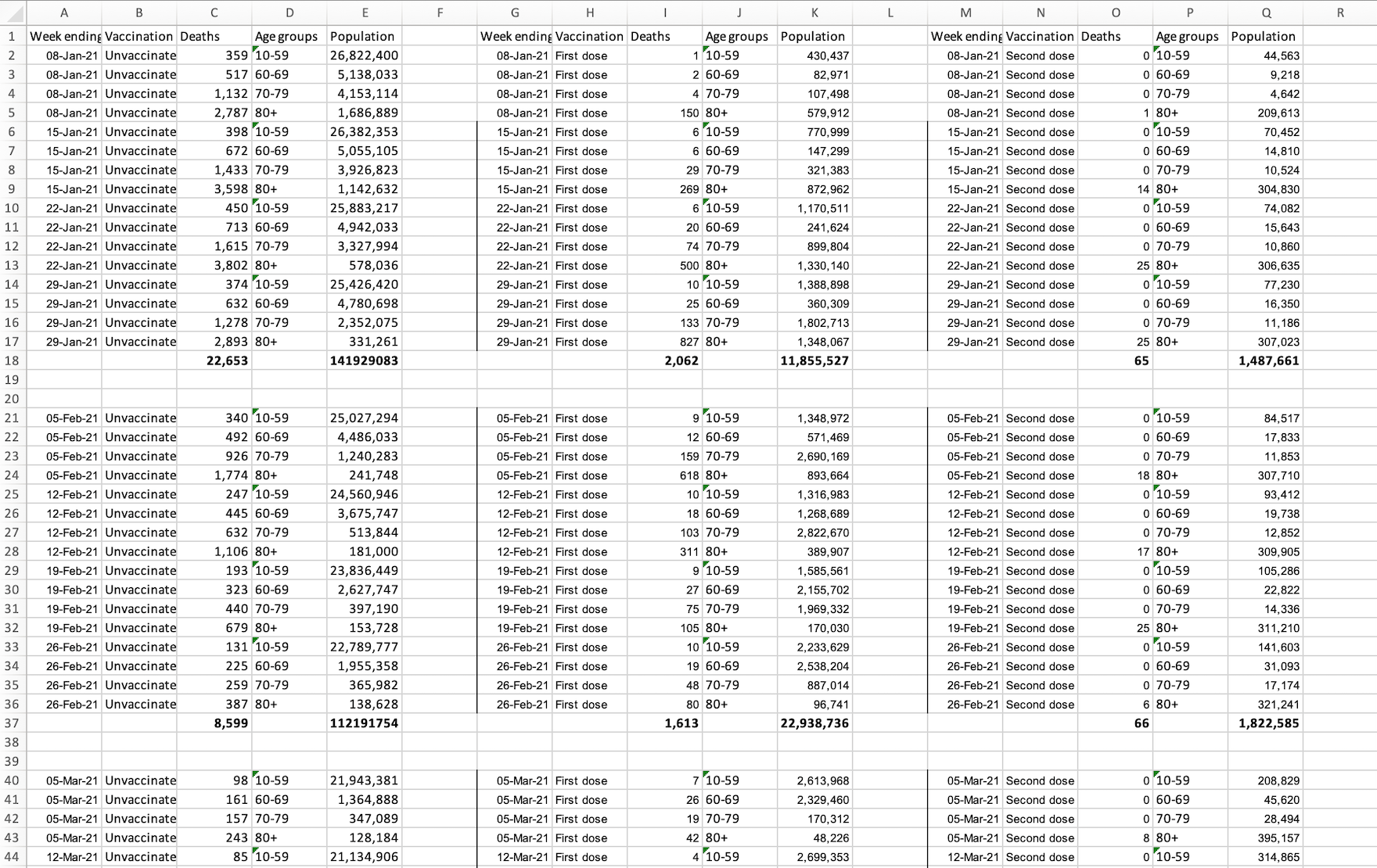
One of the datasets used
Prior to designing an appropriate set of data visualisations, it was imperative to obtain the requisite statistics to guarantee sufficient data for analysis. Multiple datasets were acquired from several reputable sources, including the NHS statistics archive, which can be readily accessed here. Leveraging these resources, comprehensive calculations were performed on a monthly basis to ascertain crucial variables such as total population, vaccinated and unvaccinated individuals, and the number of fatalities. This approach facilitated a scalable framework for conducting meaningful comparisons and drawing insightful conclusions.
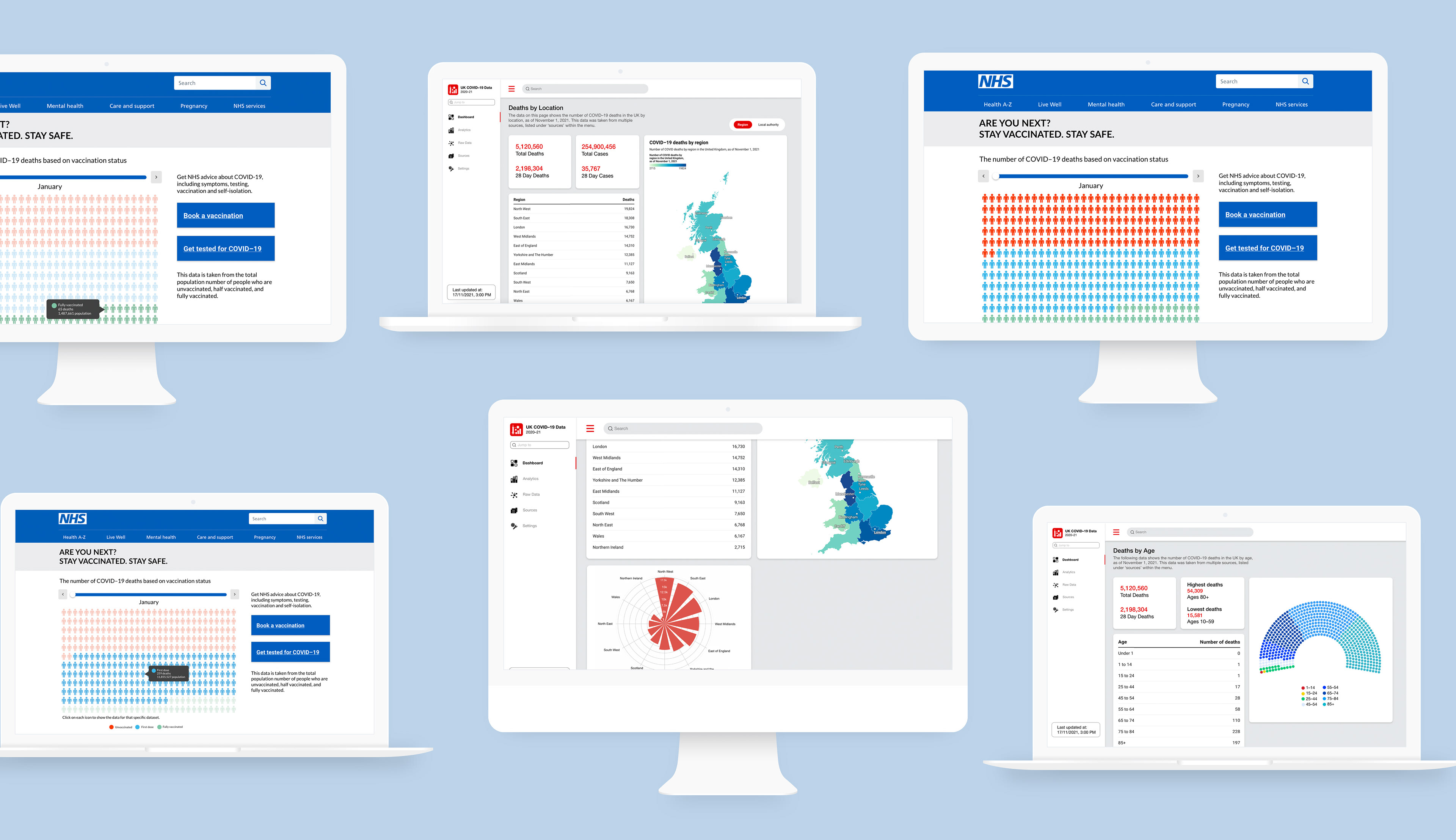
GENERAL AUDIENCE
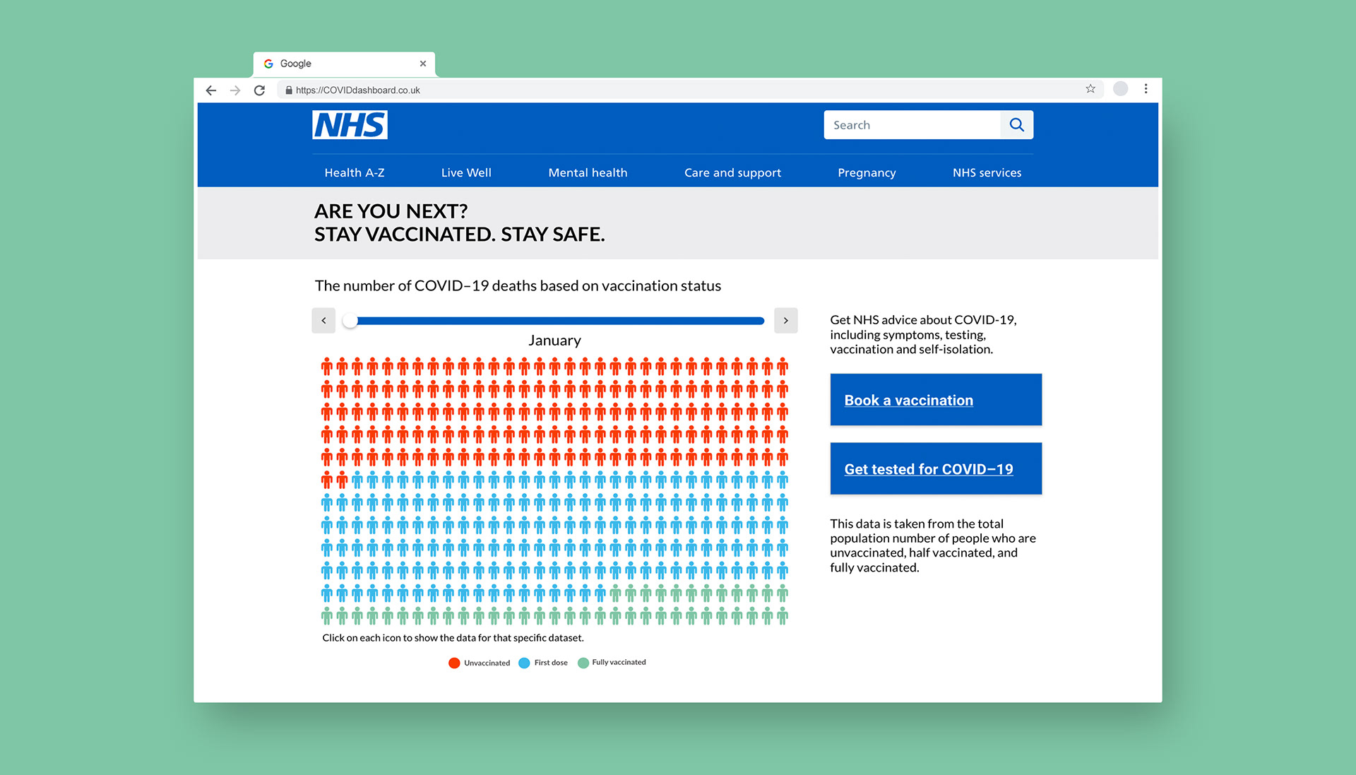
General audience data visualisation displayed on the NHS website

Screens of the interactions between different datasets
The concept behind the visual representation intended for the general audience entailed an interactive diagram thoughtfully positioned atop each page on the NHS website. Deliberately incorporating this system directly within the website was a strategic choice, driven by the realisation that the NHS website attracts a substantial number of daily visitors seeking COVID-related information. By virtue of this placement, the visual depiction could effectively reach its intended audience and fulfil its overarching objective: informing users, particularly those who remain unvaccinated, about the profound impact vaccines have on mortality rates while concurrently motivating them to schedule a vaccination appointment.
EXPERT AUDIENCE
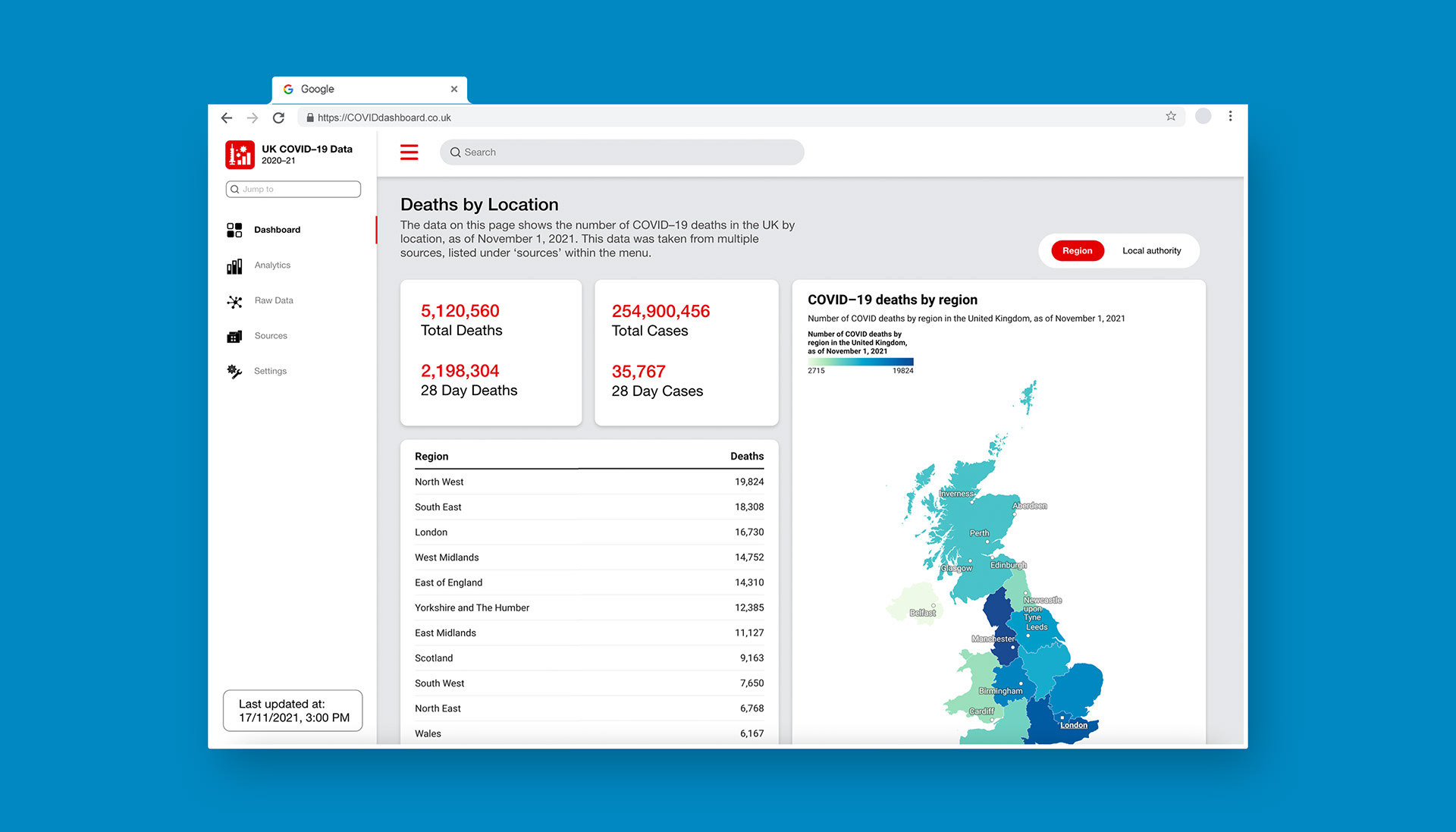
Expert audience visualisation displayed as a dashboard
To cater to the needs of expert users who use the statistics to analyse, interpret, and derive trends from data, a dynamic dashboard concept was designed. This platform enables users to seamlessly access both raw statistical information and graphical representations. By providing a comprehensive range of data, experts can make well-informed decisions that benefit the wider general audience. Given the target audience's expertise in handling intricate data forms, the dashboard offers a diverse array of data visualisations tailored to convey various data types effectively. For instance, visualisations can portray data differentiations such as deaths categorised by region, age, and month, providing a nuanced and elaborate understanding of the results.

Screens of the interactions between different datasets
Upon users' arrival at the dashboard, the initial display promptly showcases COVID deaths categorised by region. This deliberate arrangement is crucial as it affords users the opportunity to grasp the overarching trend of COVID-related fatalities across the entire country. This perspective is of paramount importance to the target users, who seek to comprehensively comprehend and scrutinise the impacts on the population as a whole. Subsequently, users can easily delve into specific subtopics by simply clicking on the designated buttons, seamlessly navigating them to the relevant pages where more detailed information and data visualisations pertaining to those specific aspects can be accessed.


